A team of more than 40 IBM consultants have undertaken a massive redesign of IBM’s web properties: a galactic redesign that includes both the external website and internal intranet.
The core objective: a Single design system that converges the intranet (W3) and Internet standards, incorporates reusable design patterns and evolves the design system through collaboration.
Among the key design goals:
- Redesign w3 and ibm.com so that they clearly communicate IBM and IBMers at their best
- Design a new digital experience for IBM.com that looks, sounds, thinks, and performs like IBM
- Introduce IBM experts, innovators, collaborators across the web, both internally and externally (.com and external web)
- Encourage behaviors that support the workforce enablement strategy
The massive redesign project is design version 17 (v17; v9 of the intranet, w3). Among the new design undertakings:
- One design system: converging www & w3 design systems
- User interface design: templates, elements, guidelines, standards
- Technical: HTML, CSS, JavaScript
- Process: Community, iteration, design patterns, compliance
- High level information architecture: masthead categories, footer
- Only have 4 persistent links in the w3 masthead (w3 Home, BluePages, Help Central and Feedback) and no page Footer
- The new masthead includes over 100 links to w3 sites and applications employees use most
- Over time, new features like your ODW Essential Links, Alerts & Notifications, and collaboration features will be added
- New visual design: masthead, content space, etc.
- Browser “layout”, page width, column grids, templates
- Local navigation
- Right column

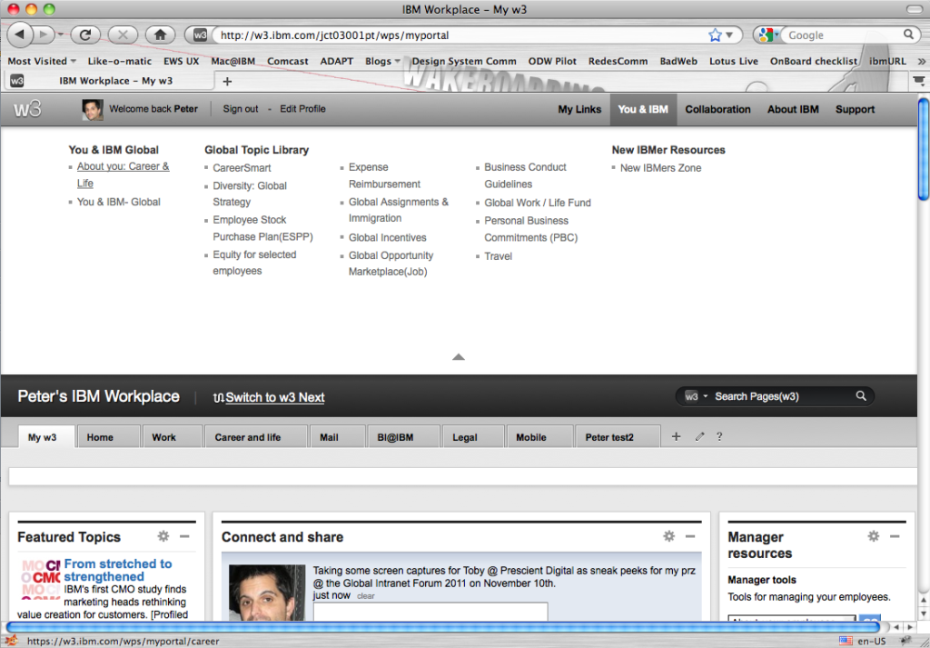
The New IBM Intranet, 2011
Among the audacious design changes is the elimination of the old, corporate “big blue” colors and a more progressive white and black look and feel, and the elimination of left-hand navigation that is instead migrated to large, drop down menus – or “mega menus” – that fall under the main, global navigation buttons.
“The new design uses darker and more subdued colors in the masthead and footer but brighter colors and more readable fonts in the content space making it easier for you to focus on where the real action is happening on the page: the content space!!,” says Peter Ceplenski, Manager User Experience, IBM, and one of big blue’s redesign’s commanding officers.
“The w3 portal, also known as the OnDemand Workplace (ODW) has been the corner of the intranet you can make your own. However, customization hasn’t always been easy or intuitive,” says Ceplenski. “The new design makes it incredibly easy for you to add and remove widgets from the page, to change the layout of the page, and even allows you to easily add and remove your own pages customizing each for the way YOU work.”
“Don’t like where we’ve placed a widget? Drag that widget to a different part of the page or remove it all together replacing it with something that will make you better informed or more productive!”
Among the many benefits of such a massive redesign revolution:
- Reduced time and effort needed for maintenance and design improvements via:
- Driving design elements through the common CSS and services. (This will simplify design updates in the future, leading to some design updates where adopters won’t even need to touch their pages.)
- Converging w3 and www design standards. (One set of standards to know, and greatly simplified development for sites in both spaces.)
- Enablement of further evolution of the site in support of the Digital Strategy
- Allows adopters to to easily leverage strategic widgets and features through an agile digital design framework
- Dynamic delivery of merchandising and Expertise Locator services through our services framework (higher conversion through personalization and contextual positioning)
- Improves the user experience
- Easier navigation through use of mega-menu’s (higher conversion through ease-of- use)
- Showcases IBM at its best through a more modern look and feel and innovative user interactions
- Synchronizes Smarter Planet and Centennial design strategy, look and feel
The Intranet is Dead
IBM has developed a mission for their intranet, a Jerry Maguire-esque mission statement manifesto on how the intranet should evolve… beginning with its death. In IBM’s own words:
No longer is there a single information workplace. No longer are we bound by the strict confides of a firewalled digital destination. The way we work transcends the binary notions of ‘internal’ and ‘external’. The body of knowledge we access and to which we contribute is now globally distributed across individuals, communities and disciplines. And our communication is constant, immediate and ubiquitous.
The vehicle through which we interact with our colleagues, customers and communities of practice needs to reflect this shift. As an organization, we must reconceive how to serve and empower a global workforce – professionally and culturally – in a way that enables everyone to achieve his or her full potential.
W3 must change to serve the expanding needs of IBMers by seamlessly integrating with IBM.ocm – evolving from distinct toolkit to integrated service; from a walled garden to a mode of engagement. W3 can become the service through which digital citizens (users/employees) engage to make the world work better.
In the future, w3 will cease to be a separate destination for IBMers. Instead, it will seamlessly integrate into IBM.ocm and the Web, serving as the frame through which they relate to their colleagues, the enterprise, their clients and partners. It will inspire and enable each of them to be a steward and standard-bearer of the IBM brand.
This service will exist as a series of permissioned information modes, customized to perfrom a variety of functions:
- As a private space (Individual) for IBMers to be served, supported and advised by IBM
- As a forum for dialogue (Enterprise), collaboration and learning with IBM
- As an inviting workspace (Partner) for the communities of practice both inside and outside of the company
- As a clearinghouse (Global) for essential information, news and content
Whatever the name or label, it’s clear that the intranet is evolving, and IBM is one of the leaders of the evolutionary revolution; a technology neutral revolution that is above and beyond the advent of social media, personalization, and the latest and greatest technology.
– OMG is that for real? This is not a wireframe!? really!
“more progressive white and black look and feel”
Dude, your “team of more than 40 IBM consultants” needs a real deal interaction designer or visual designer, this sucks!
It certainly does not “suck”. The feedback from IBMers has been very positive. They’re not trying to cater to you, they’re catering to IBM employees.
Does the feedback come from IBM employees from the 1980s?
Why are you trash talking an intranet design? Have you heard of a company called Apple? Have you noticed the popularity of their white and black approach to design? I mean, are you an IBMer? Are you so in-touch with what IBMers want and expect that you’re confident in your evaluation? Have you ever heard the expression, “To each their own”…?
I think it’s telling when people insult and trash talk on a blog with ‘anonymous’ gmail accounts.
I’d be curious to know whether they adopted a user-centered approach for this massive redesign: I suppose so, but for some reason there is no mention in the article.
Did they test it with their users, for instance?
I have a friend at IBM, will be asking him his thoughts about it.
Thanks,
Pingback: Г©mergenceweb : blogue » L’intranet est-il en train de mourir, oui ou non ?
Pingback: The intranet is dead « Aun sin Nombre
Pingback: Ibm esplora nuove strade nell’intranet design | Intranet Management
I’m loving the clean B&W navigation / layout look. Although its hard to keep a clean design and needs constant monitoring of colours/icons/links etc.